When Visuals Override SEO, and Why It Sometimes Works
Most advice about websites starts from the same assumption: clarity wins. Clear headings, clear copy, clear structure—all working together to make meaning obvious at a glance. And for most businesses, that approach is not only sound, it’s necessary.
But some of the most visually striking websites succeed while doing very little of that. Instead of leading with explanation, they rely on imagery, mood, and implication—and somehow, they still work.
This isn’t because SEO suddenly stops mattering. Instead, this is because context has already done the work that clarity normally would.
When Clarity Is Already Established
Visual-first websites tend to work only when the hard work has already been done elsewhere—through brand awareness, reputation, or distribution that sets expectations before the page ever loads. When users arrive knowing what they’re looking for, visuals don’t need to explain or persuade; they simply reinforce what’s already understood.

Apple:
When the Brand Is the Search Term
Apple’s product pages are famously sparse—large imagery, minimal copy, and long stretches where visuals do the heavy lifting. From a traditional SEO perspective, this would be risky. But Apple isn’t trying to explain what an iPhone is. By the time someone lands on that page, the question has already been answered elsewhere.
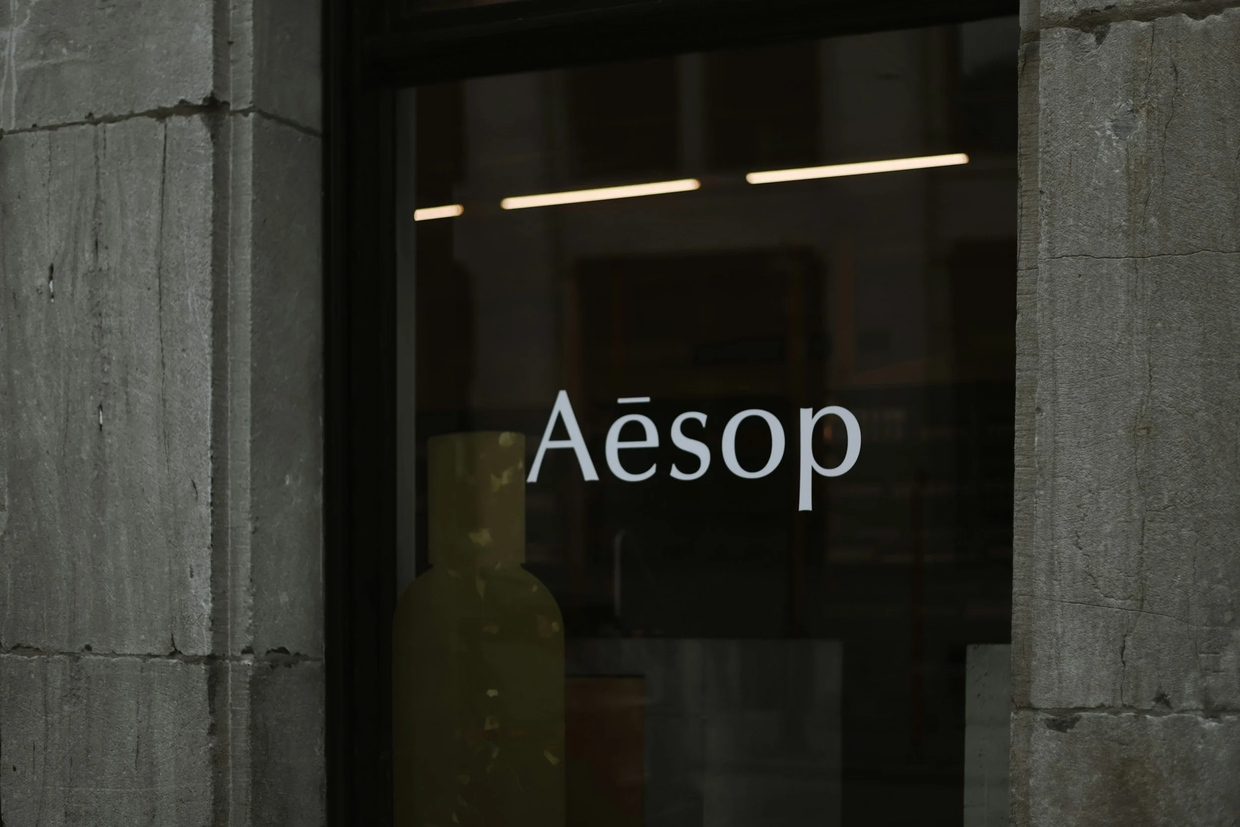
Aesop:
Choosing Mood Over Discoverability
Aesop’s website feels closer to an editorial publication than a traditional ecommerce store. The language is poetic. The structure is intentionally understated. Even common search phrasing is often avoided—not by accident, but by design.
This isn’t a failure to optimize.
It’s a deliberate trade-off.
Aesop prioritizes brand coherence over search volume. Discovery happens through reputation, physical retail, and long-term loyalty rather than long-tail queries or explanatory copy.
In this context, visuals don’t compete with SEO.
They override it—because the brand experience is the product.

Squarespace:
Copying the Look Without the Context
Squarespace showcases many award-winning sites that are undeniably beautiful and intentionally text-light. For established brands, this approach can work—sometimes exceptionally well.
Unfortunately for smaller businesses, it often doesn’t.
Without first establishing a digital framework for search engines to crawl and understand, minimal copy turns into minimal context. Search engines struggle to understand the offering, and users are left to infer what the business actually does and why it matters.
The result is a site that looks confident, but quietly underperforms—especially where discovery and explanation are required most.
The Actual Pattern
Once you stop looking at these sites individually, a clear pattern starts to emerge.
Visual-first websites succeed when:
the brand is already known
user intent is clear before arrival
discovery happens outside of search
They struggle when:
the business relies on organic discovery
explanation is assumed instead of stated
SEO isn’t so much about algorithms as much as it is about removing ambiguity.
When ambiguity has already been resolved by brand strength, visuals can take the lead.
When it hasn’t, visuals alone simply aren’t enough.
The Takeaway
Design on its own does not fail SEO.
However, design without context relies heavily on reputation for it to succeed.
Most businesses don’t have the luxury of being understood without explanation. The strongest websites don’t ask visuals to replace meaning. Instead, they ask visuals to carry meaning that’s already clear.
That’s not choosing one over the other.
That’s knowing how to walk the fine line between the two, whilst making sure each is actually doing its job.